Fracture is an e-Commerce company that sells high quality prints on glass. One of the initiatives I worked on as Director of Design was improving the conversion rate, average order value, and user experience of the photo upload flow, the core feature of the web application.
Analysis of existing user flow
Fracture’s conversion rate was less than 2%, and we hypothesized that part of the issue was problems in the flow of the photo upload feature. My team and I conducted a review of the current flow through a variety of methods:
Full Story to evaluate users’ behavior and pinpoint areas of friction.
20 user interviews to understand the state of mind in which users come to this flow, to understand their pain points, and to create personas of our most common users.
Competitive research to understand the landscape of approaches to similar UX problems.
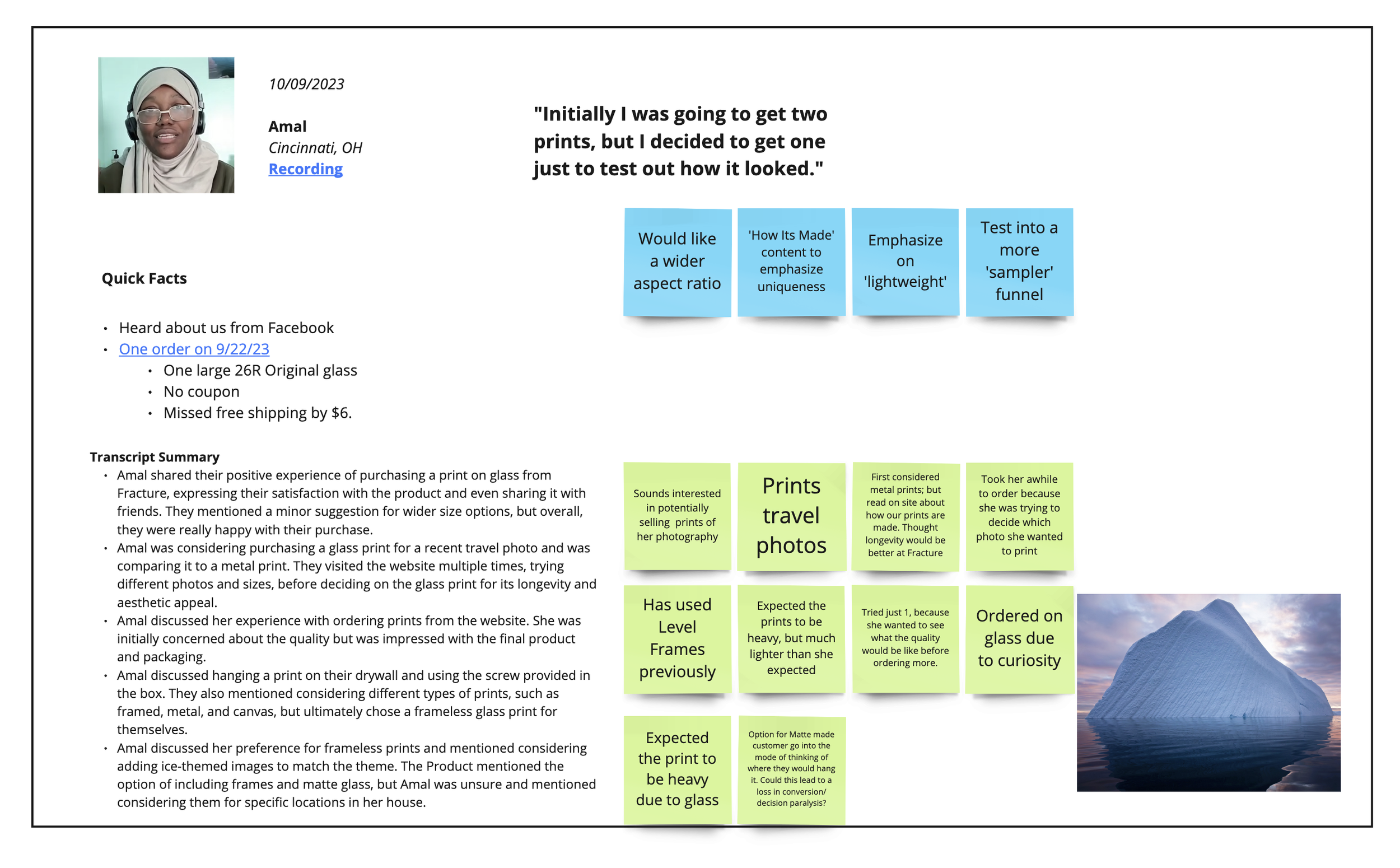
Example of user interview
Key points in our discovery
Through these methods, we identified our most common users, the most prominent points of friction, and missed opportunities in the user experience.
To be kept in mind: a large portion of our users are 40+, and there is a notable contingency who are not technically savvy.
Users entered into flow and became overwhelmed because their initial questions about glass prints had not been answered.
Print size selection process was confusing to users, particularly when their photos were not high enough resolution for the print size they’d selected.
Some users were not aware of product options, such as photo walls (gallery walls that discounted a bundle of prints).
Users are not aware of print accessories available (frames, stands). We’re missing an opportunity in the flow to upsell these items.
“Why can’t I use my image on a large size print? Why does it say the image is low res?”
COMMON USER SENTIMENT
Proposed solutions and A/B Tests
We determined what was in scope, came up with proposed changes, and designed a host of A/B tests to analyze whether our hypotheses were correct.
We drew the conclusion that educating users about glass prints should happen earlier in the marketing funnel, before they enter into the photo upload flow, so tackling this issue was out of scope.

File Size Education
Test if educating about file size vis a vis print size at the beginning of the flow, rather than after a user uploads, would alleviate confusion

Clarify UI
Test if clarifying UI elements, such as button states and warning states would alleviate confusion about photo resolution issues

Interstitial Page
Test an interstitial page that allows users to select their product path and informs them of their options

Accessories Upsell
Test upselling accessories and UI updates in order to increase AOV and educate users about their options
File size education test
Hypothesis
We believe clearer requirements messaging, social proof, and help options on the initial upload screen will lead to an increase in photo uploads.
Variant
Control
What changed
Included real photos from customers, press articles, and “11 million...” text. Added to boost trust at the beginning of the upload process.
For mobile, we reduced the height of the woman holding the image uploader to allow other elements to creep above the fold. Helps alleviate a “false bottom” misconception.
Included an FAQ section
Results
Conversion rate increased by 3.6%
Photo uploads increased 6%
AOV increased by 3%
Clarifying UI
Hypothesis
We believe modifications to the "choose a size" step in customizer will lead to an increase in clicks on the "select size" CTAs.
Control
Variant
What changed
The original design featured a large tool tip that was distracting and pushed down the CTAs on mobile
The variant simplified the tooltip so that the CTAs would be more accessible
Results
Completion of “choose a size” increased by 3%
Conversion rate increase not statistically significant
Interstitial Page
Hypothesis
We believe that adding a page previous to the photo upload flow that allows users to choose between single prints and bundles will increase AOV.
What changed
The only way for users to access Photo Walls (bundles of prints) previously was through a dedicated landing page
With this change, users see the option of single prints or Photo Walls every time they go through the photo upload process
Results
AOV increased by 7%
Photo Wall orders increased by 3%
Accessories Upsell and UI Updates
Hypothesis
We believe that upselling accessories and updating elements in the UI will lead to an increase in AOV and educate users about their options
Control
Variant
What changed
Delineated items in order by using a card layout
Added “Order total” heading, following standard practice
Added bar indicating progress toward free shipping
Added upsell module where print accessories, such as Storyboards can be featured
Results
AOV increased by 7%