Rebranding and renaming an e-Commerce company
Fracture is an e-Commerce company that sells high quality prints on glass. Due to an outdated brand and a confusing name (a glass company called Fracture?), the CEO asked me to lead a renaming and rebranding of the company. I vetted a number of branding firms and eventually chose Ludlow Kingsley, due to their high end feel and their willingness to collaborate with the in-house team. The work shown here is a result of part of my collaboration with them.
Market research showed us that there was a disconnect between the brand and the product. The product is high end and sleek, and the cost reflects that. However, the brand did not feel premium enough to align with the price points. One of our goals was to make sure the new brand represented the company in a way that made sense vis a vis the cost of the product.
Another thing we took into consideration as we embarked on this project was that 55%+ of Fracture’s audience was over the age of 45. We wanted to create a brand that welcomed in people of younger generations, but also resonated with and did not alienate the older audience.
Original logo and website
Naming and logo
We went through many iterations of names, searching for something that referred to the fact that the product is unique due to the materials used, but we also wanted the name to be broad enough to allow for other innovative products to be added in the future. We settled on Modern Medium, feeling that it met the criteria. We wanted the logotype and logomark to feel contemporary and elevated, but not out of reach.


Brand Personality
Although our aim was to elevate the brand, we also wanted it to feel attainable and approachable, and to let people know that we are a high end and more affordable option than going to a frame shop and having something custom framed. The “personality” we wanted to convey was friendly, charismatic, and knowledgeable.
Color and Typography
For color and typography, we operated under the same guiding principals of contemporary and elevated but friendly.
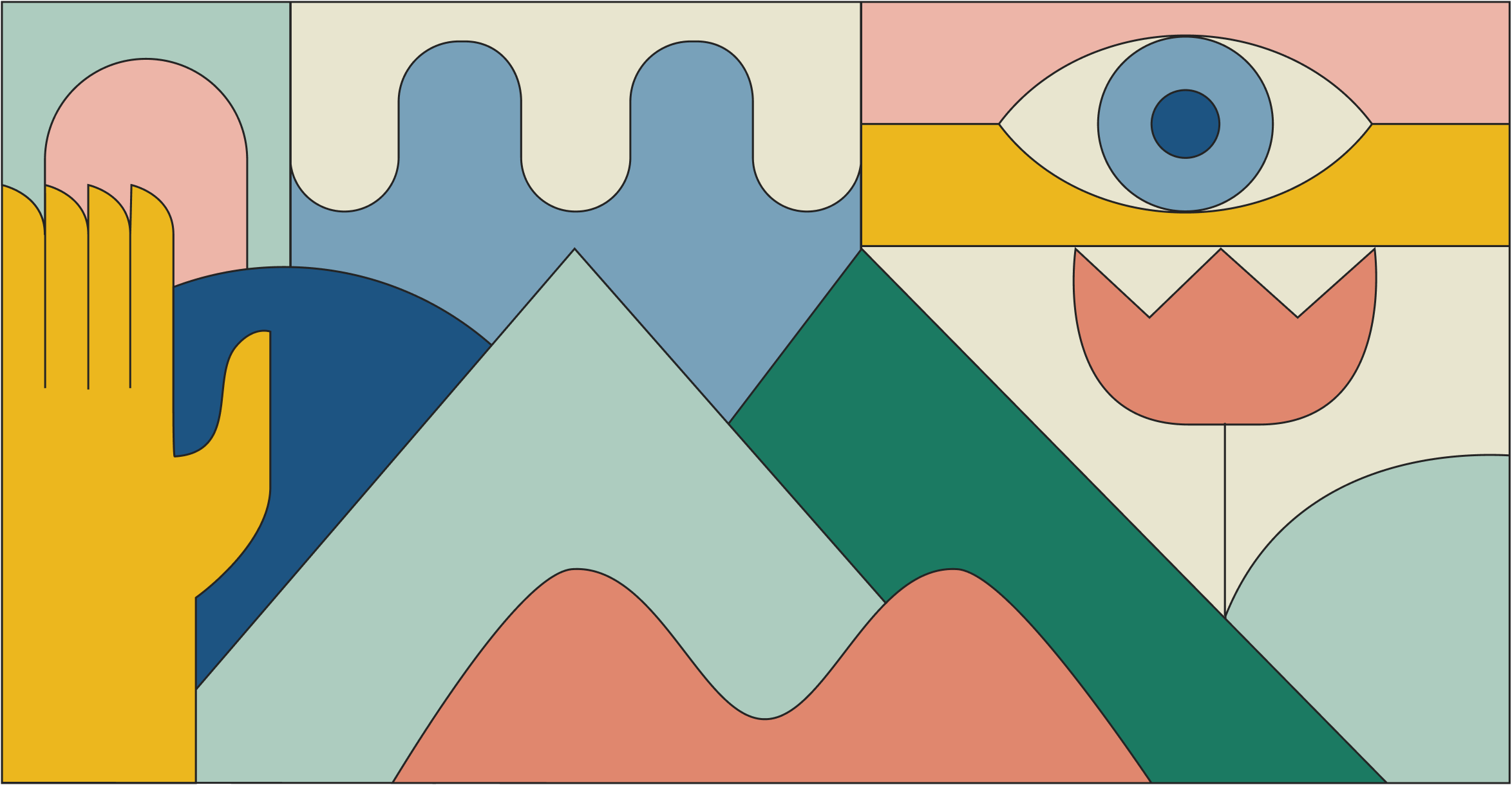
Illustration, iconography, photography, and examples in context
The illustration style we settled on was clean and inspired by stained glass windows. The style was simple enough that it would be easy to reproduce for future assets.