The problem
SurveyMonkey is a DIY survey platform supporting hundreds of use cases with varying degrees of complexity. However, the experience is very similar for every user regardless of who they are, what their use case is, or what part of the product journey they are in. Users love SurveyMonkey, however only use the product when they need it, leading to a lack of engagement and user retention.
MY ROLE: DESIGN LEAD
“We finished our current survey, so no need to use your product at the moment. We will use your services again in the future.”
— SURVEY MONKEY USER
Original state
These were the original Logged In Home screens. There is a zero and an active state. The zero state encourages users to create their first survey, and the active state is a list of the surveys they’ve already created, where they can find, manage, edit or create more surveys.
While the pages were functional, our user research proved it wasn’t very inspiring, educational, or engaging.
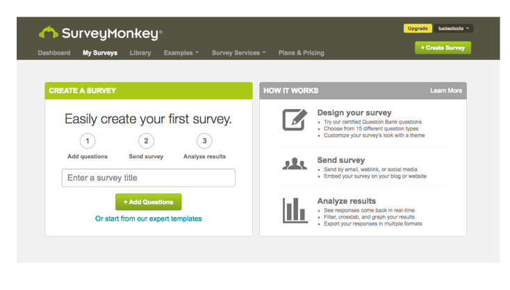
Zero state
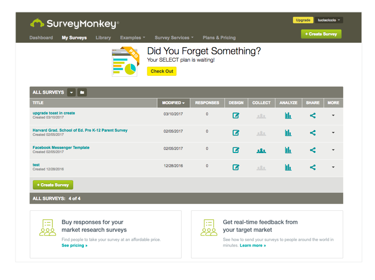
Active state
Strategy and process
We planned to use SurveyMonkey’s Machine Learning and Personalization platforms to create a new, more useful user dashboard. The goal was to give the user an overview of the status of the surveys and the data within their account. The user would be notified of changes to their results and be able to monitor their active surveys straight from their home page.
Users without active surveys would have a zero state which would allow them to easily get started in creating a survey, and also give them other tasks to do. If a user wasn't ready to create a survey, their dashboard would also allow them to answer a topical question, answer a survey for charity, or complete their profile. All activities were designed to educate the user on what they could use SurveyMonkey for and to get them excited to start using the product.
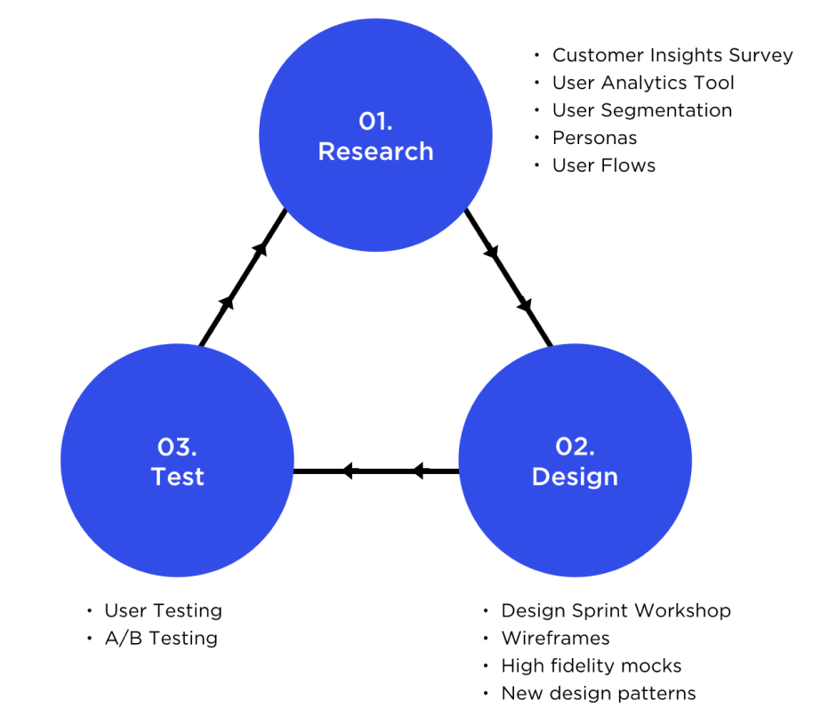
Research
Using surveys and a custom built user analytics tool, we were able to hone in on our most common users and create proto personas (not validated by user interviews).
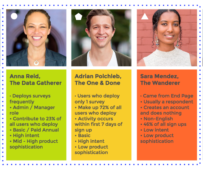
We were also able to define different user segments based on engagement behavior. We called them:
The One & Done: 16% of all users who come to the product to send only one survey and then leave.
The Data Gatherer: 6% of all users who use SurveyMonkey on a regular basis (the engaged user)
The Wanderer: The rest are users who haven't deployed (either drafted or haven’t done anything at all).
To cater to these segments, we decided to create two dashboard concepts: one for the low intent user, and another for the high intent user.
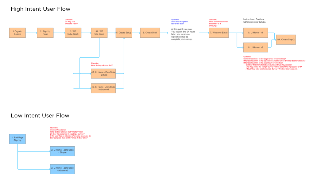
Customer Journey Flows
Once it was determined that we were going to develop two different concepts for low & high intent users, I created a user flow diagram which assisted the data science team to write up a prediction model which qualified users for either concept.
For example, users who signed up via SEO or direct channels and completed their profile, qualified as high intent users and were served the dashboard which would be designed to get them to create high quality surveys and feel more confident to deploy faster.
Users who signed up via the respondent end page of certain surveys were deemed low intent and were served a dashboard experience which facilitated more product exploration and education.
Design sprint
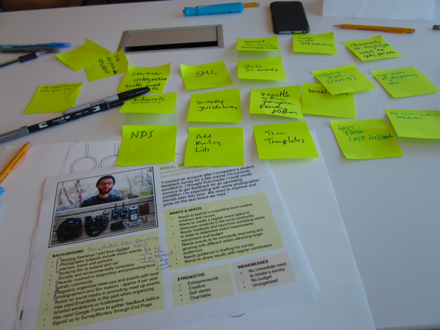
In order to diversify my thinking, I organized a Design Sprint workshop with 14 attendees from different areas of the Product & Engineering org to meet for a half day and brainstorm dashboard concepts.
We reviewed the research, and framed the design problem. Each participant had a design kit that included either the high intent persona or the low intent persona. In pairs they then wrote on post-its what features or information would interest their persona. Then the persona groups converged and decided what features were most engaging and important to their persona and arranged the chosen post-its in a dashboard wireframe. They then concluded by pitching the dashboard design to the opposing persona group and having that group provide a critique.
The sprint was helpful in providing me validation for some of my existing ideas, as well as highlighting new ideas and critiques that I hadn’t considered.
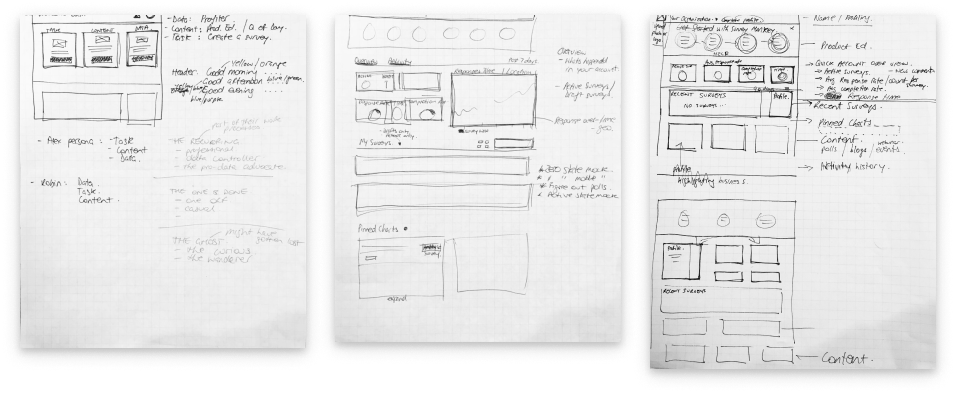
Design ideation
I sketched out ideas before going to more or less high fidelity designs. Sometimes I’ll sketch instead of creating formal wireframes. (Unless there are complex interactions, then I will wireframe and prototype before going hifi.)
Zero State / Low Intent
Designed for users who do not have an immediate need to create a survey. Primary objective is to get them to explore the product either by completing their profile, answering a poll question and completing a survey to donate to charity.
Zero State / High Intent
Designed for users who have an immediate need to create a survey. Primary objective is to motivate them to get started and get them excited to see their results.
Active State MVP
The active state was much more complex. Features included were:
Welcome Banner including user name and company name
Summary Stats: aggregate stats that give the user an idea of what is currently happening in their account
Recent Surveys list: featuring surveys that received activity in the last 90 days
Profile module: to motivate the user to provide more details about themselves to better personalize their experience
Quick Poll module: featuring a topical question to get the user curious to start asking their own questions
Survey Tips: featuring blog content and survey best practice advice
A/B Testing
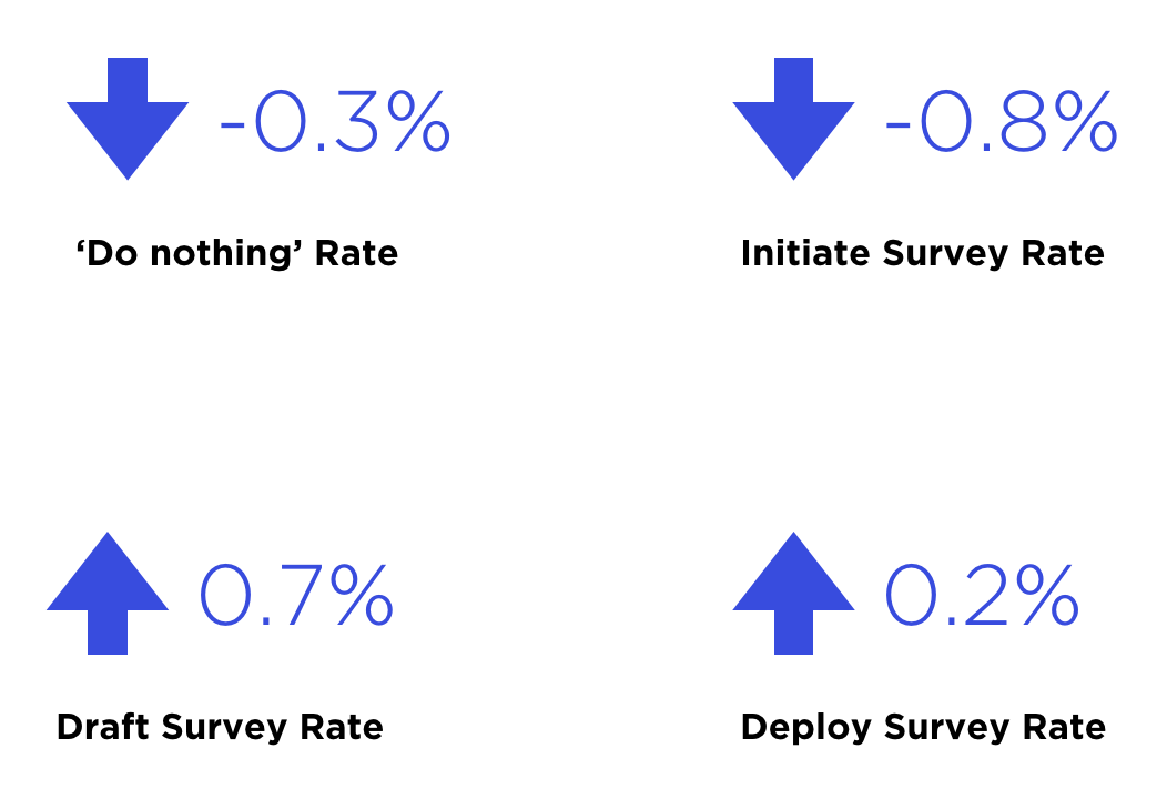
To ensure we didn’t negatively impact the core business metrics, we ran the dashboard through A/B testing to see how it would perform against the old Logged In home page.After 2 weeks of testing, we found the following:
The 'Do Nothing' rate decreased which means we were able to increase engagement slightly
Initiate survey rates reduced which means less people were creating test surveys to explore the product. This was due to better product education and onboarding, however, we still wanted users to create surveys so we iterated on the design to encourage a lift in this number. We eventually replaced sample survey on the dashboard with prebuilt templates.
The Draft survey rate increased which meant more people were creating proper surveys
Most importantly, the rate of deploying (sending) surveys increased, which meant users were reaching their goals and completing their tasks with greater ease.
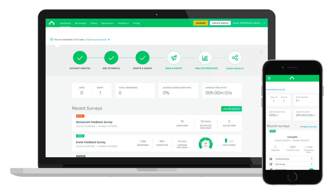
The End Result
The Dashboard Zero and Active State MVP launched and became the new logged in home page for Survey Monkey users. We continued to iterate and test in order to provide users with more personalized experiences.
I also applied a UI upgrade as part of SurveyMonkey’s company-wide redesign.
In this iteration, we gave the user greater visibility and control over their account. Included in this iteration:
Data visualizations
Ability to pin charts
Notifications in header
Team management for enterprise
Activity Feed
Templates (especially helpful for low intent users)